When choosing tiles for a renovation, most homeowners spend time comparing colours, patterns, sizes, and finishes. But there’s another design decision that can dramatically change the final result: grout colour.
Grout may seem like a small detail, but it affects how noticeable your tile pattern becomes, how spacious a surface feels, and even how easy it is to maintain. The same tile can create completely different looks simply by changing the grout colour.
So, should your grout match your tile or create contrast? Here’s what to consider before making your choice.
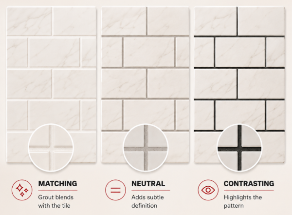
Choosing grout in a similar colour to your tile helps the grout lines visually blend into the surface.
For example, white tile with white or light grout creates a clean, continuous appearance. Beige tile paired with warm beige grout can achieve a softer, more natural effect.
Matching grout works especially well when you want to:
This approach can be particularly effective with large-format tiles, where fewer visible grout lines enhance the feeling of a continuous surface.
Want the shape or layout of your tile to stand out? Choose a contrasting grout colour.
Think of classic white subway tiles paired with dark grey grout. Instead of disappearing, every grout line becomes part of the design and emphasizes the tile pattern.
Contrast works particularly well with:
However, strong contrast also makes every grout line more noticeable. That means careful installation and consistent spacing become especially important.
If matching grout feels too subtle but high contrast feels too dramatic, a neutral shade may be the answer.
Soft grey, warm beige, greige, and other mid-tone grout colours can define individual tiles without dominating the overall design.
Neutral grout is also versatile. It works with many stone-look, concrete-look and marble-look tiles and can complement both warm and cool interior palettes.
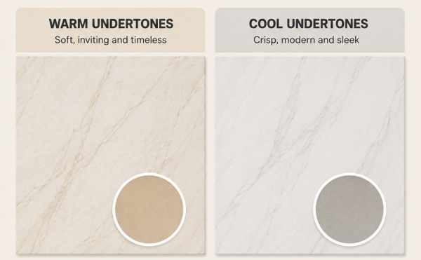
Don't choose grout based on whether a tile is simply “white,” “grey,” or “beige.” Look closely at its undertone.
A warm white tile may contain cream or beige tones, while another white tile may lean cooler and slightly grey. Pairing a warm tile with very cool grout—or vice versa—can sometimes make the combination look disconnected.
The same principle applies to marble-look tiles. Consider the colour of the veining when selecting grout rather than matching only the tile's background colour.
Whenever possible, compare grout samples directly against your tile before making the final decision.
Appearance isn't the only consideration.
Very light grout can create a bright, clean aesthetic, but it may show dirt and discolouration more noticeably in high-traffic areas. Medium and darker grout colours can be more forgiving, especially on busy floors and entryways.
The location matters too. Grout surrounding a kitchen backsplash faces different conditions from grout installed on an entryway floor or inside a shower.
Proper installation, cleaning, and sealing—where required for the grout product being used—can help maintain its appearance over time.
One of the easiest mistakes to make is choosing grout from a small colour swatch without considering the entire tiled surface.
Although grout occupies relatively little space between individual tiles, those lines repeat across the whole installation. Once an entire wall or floor is grouted, the overall effect can be significant.
For example:
White tile + white grout → soft and seamless
White tile + grey grout → subtle definition
White tile + black grout → bold and graphic
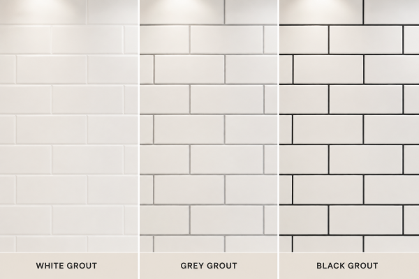
There isn't one universally “correct” combination. The right choice depends on the effect you want to create.
Whenever possible, select your tile first and your grout second.
Tile should establish the main colour, texture, and character of the space. Once you know exactly which tile you're using, you can compare several grout colours beside the actual product.
Consider the tile's:
Looking at the combination together is much more reliable than choosing grout independently.
The right grout colour can be the difference between a tile installation that simply looks finished and one that feels thoughtfully designed.
Choose a matching grout for a subtle, seamless appearance, a contrasting grout when you want to emphasize shape and pattern, or a neutral grout when you're looking for balance between the two.
Most importantly, don't treat grout as an afterthought. Consider it alongside your tile, room design, maintenance needs, and desired overall effect.
Explore our Grout selection to find options for your next tile project, or visit Tile Solutions in North York, Mississauga, or Kitchener to compare tile and grout combinations in person.
(By: Khanh Linh Le)